
Instructional design is kind of a new field. It started emerging in the 60s when psychologists were first looking into how people learned. It’s a few decades later now, and the field is ever-expanding. Now, instructional designers are like graphic designers with experience both in psychology and education. The courses are pretty to look at, get a point across, and are designed to make people remember what they’re supposed to. If that is a bit confusing, let’s take a look at an example of a course before an instructional designer, and after an instructional designer.
| Before | After |
 |
 |
|
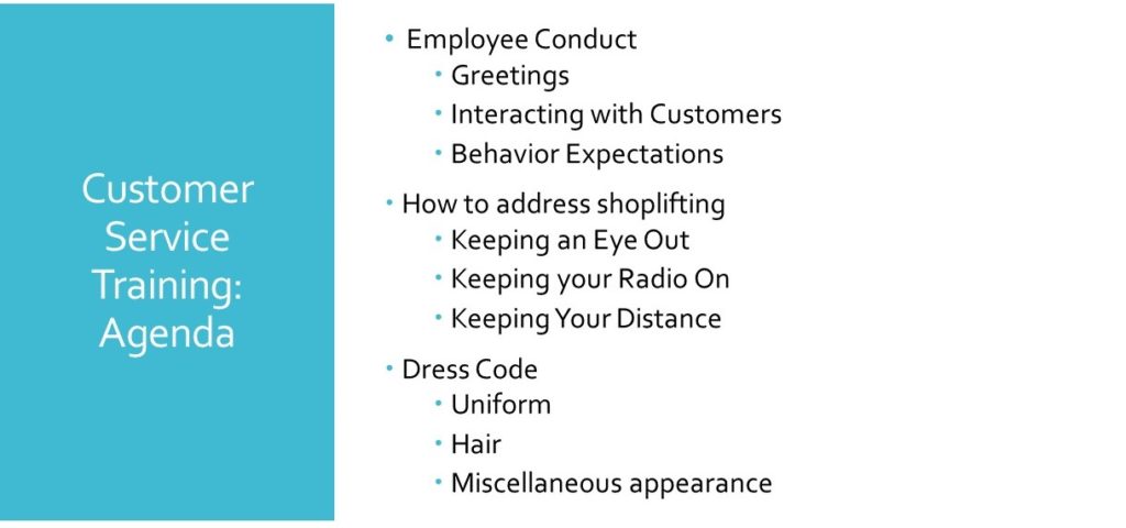
This type of training is usually instructor-led, in a room with 8-40 employees, most of whom have no desire to be there. While the text on the page is minimal, it still LOOKS like a lot, which is likely to cause learners to decide not to listen or their minds to wander accidentally. In short, it does NOT capture learner attention. The good things:
This design is one that comes pre-built in Powerpoint. Many people go no further than selecting a pre-existing theme and typing in the information, choosing to focus more on what the instructor is going to say than on what the learner sees. |
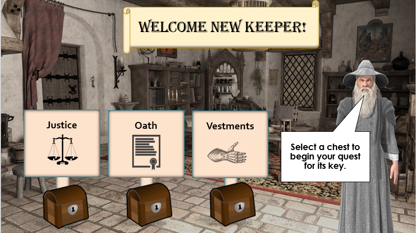
This type of training is called eLearning. Elearning courses are usually online or computer-based interactive training that employees can take individually. They are usually self-paced.
This course covers the same topics as the first one.
Rather than listening to an instructor speak about a topic for 45 minutes or more, the learners would then experience short bursts of learning broken up by interactive activities. Examples include:
While this more playful approach may seem too informal for the corporate world, this design plays on several psychological theories of adult learning.
|