
When taking a training course, presentation, or documentation, have you ever noticed the colors that are used? Sometimes a company doesn’t use their company colors and instead focuses on a different color palette. You may notice that some colors, such as red, are avoided and other colors, such as yellow or blue, are used more frequently than most. That’s because colors play an important role in how we take in information and how we use it.
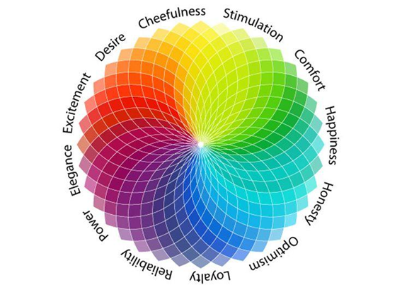
Take a minute to think about what you learned about colors in school. Children in school associate colors to mean certain things. For instance, let’s think of a stop light. Even kids five years old understand that green means go, yellow means slow down, and red means stop. Kids also often associate colors with their emotions. For example, they may see a yellow sunflower indicating something happy or the color red signifying angry. This concept of the meaning of colors falls under Color Theory, which is why it’s important for an instructional designer or technical writer to consider the colors they choose when they create training.
 Using Color Theory in training considers how people interact with the elements, such as the typography and button interactivity, used to create the training. There are too many parts of color theory to discuss, such as color schemes and accessibility, here so let’s focus on some basics.
When instructional designers and technical writers create training, they typically choose their primary, secondary, and tertiary colors. Typically, only one or two primary colors are chosen, or are the colors most frequently used. The secondary colors are another one or two colors that are used less frequently but are meant to complement the primary colors. Finally, the tertiary colors may or may not be used at all but are mostly used as accents. In the example below, the blue would be the primary color, the purple and brown would be the secondary colors, and the green would be the tertiary color.

It is also important to be aware of the cultural significance associated with some colors, so instructional designers and technical writers need to be aware of the colors they use in their training if the work is international. For example, Western cultures associate the color white to represent purity, innocence, and hope, while some Asian cultures view white as associated with death, mourning, and bad luck. With a little research and knowledge of the audience before creating the training, an instructional designer or technical writer can prevent making a mistake or causing a cultural offense.
Try your hand at creating something using colors. Simply use a new color palette on a cover page for your next presentation. There are free websites out there, such as Canva Colors or Coolors, that help create a color palette using a generator, a hex code from a color you want to use, or sometimes even an image. Give it a try!